
Benvenuti a questo nuovo articolo dedicato alla scrittura cinese! Nella scorsa puntata ci siamo lasciati con la visione dei primi due tratti fondamentali, l’orizzontale e il verticale. In questo capitolo parlerò di un altro tratto, uno solo, ma estremamente importante: il punto. Su di esso ci sarebbe una montagna da dire; a partire dalle tecniche di scrittura, alle varianti… per questi motivi il nostro nuovo tratto verrà descritto da solo.
Partiamo col dire che l’importanza del punto risiede anche nel fatto che la sua tecnica di esecuzione viene utilizzata per la scrittura di numerosi altri tratti. Il tratto orizzontale, infatti, comincia e finisce con il movimento utilizzato per disegnare il punto, e così per il tratto verticale.

Appoggiate il pennello nella parte alta a sinistra della zona dove verrà disegnato il punto ed applicate una leggera pressione al fine di appoggiare parte delle setole alla carta. Le setole del pennello hanno un’inclinazione di circa 45°, così come il pennello stesso non segue un movimento perfettamente verticale ma inclinato. Muovete il pennello verso il basso al fine di definire la parte bassa e destra del punto, il quale termina con il movimento del pennello “a ritornare” verso l’alto a sinistra; in questo modo il punto avrà una forma definita.
Il punto viene anche chiamato “diăn”, il cui carattere è “点”; a prima vista il tratto sembra relativamente semplice da disegnare ma ben presto scoprirete che è forse il più difficile da padroneggiare; il punto è una pietra in bilico, tracciata con maestria per donarle equilibrio fisico e visivo. Il punto dona completezza al carattere, come gli occhi di una persona completano il volto per donare capacità visiva. L’immagine sopra riportata mostra la direzione del più comune punto, da sinistra verso destra e verso il basso. Esso è infatti anche chiamato “yòu diăn” i cui caratteri sono: “右点”.
Come detto precedentemente, questo tratto offre una grande gamma di varianti, non solo nella forma ma anche nel modo in cui essi vengono disegnati in gruppo; nell’immagine sotto riportata potete vedere in quante forme esso può essere tracciato:
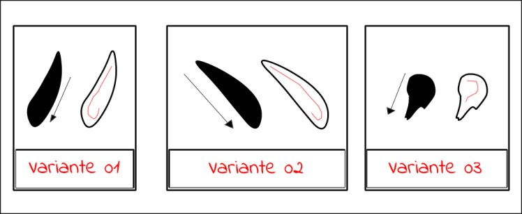
La variante 1 rappresenta la forma “inversa” del punto verso destra, infatti scende verso sinistra e il pennello effettua lo stesso movimento, ma invertito. La variante 2 è una forma più “allungata” del punto base mentre la variante 3 cambia nella forma.
Quando usare una o l’altra variante? Tendenzialmente dipende dall’utilizzo che si farà del tratto nel carattere. Parlando in termini generali, la prima variante va a posizionarsi solitamente nella parte sinistra di un carattere, come è possibile vedere per esempio in “bì”: 必 o nella variante del radicale cuore presente in molti caratteri: 忙, 性. La variante due, in contrasto alla prima, viene posizionata solitamente nella parte destra del carattere, come negli esempi riportati: 外. In questo caso il punto è leggermente allungato. La terza variante viene utilizzata nelle parti inferiori dei caratteri, come per esempio: 六, quando viene posizionato in coppia con un altro punto che segue direzione opposta.
Il punto classico interviene in tutti i casi in cui non è necessario l’utilizzo di varianti: 太 dove il punto è posizionato in basso; 心 dove il punto classico è il centrale dei tre; 火 dove il punto è a sinistra del carattere.
Poche righe sopra abbiamo parlato della differenza di scrittura anche riferita alla presenza di gruppi di punti; nell’immagine qui sotto potete vedere i due gruppi di punti utilizzati in una grande varietà di caratteri:
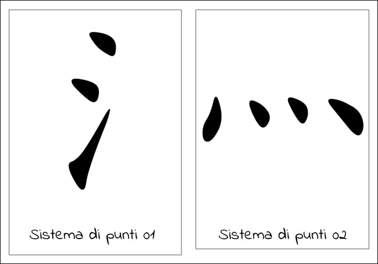
Il primo rappresenta la versione “compatta” di “acqua” e interviene come radicale in famiglie di caratteri che hanno a che fare con l’elemento liquido. Prestate attenzione a come vengono disegnati i tre punti, con l’inferiore che segue andamento ascendente.
Il secondo gruppo di punti è invece la rappresentazione di calore (presente infatti nel carattere “caldo”). Anche in questo caso i 4 punti vengono disegnati in 4 modi diversi.
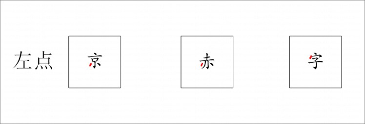
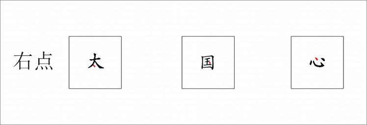
Qui sotto proverò a dividere in modo un po’ più semplice alcune varianti del punto, compreso quello “standard”, completando il tutto con i loro nomi e i caratteri in cui vengono utilizzate; la parte di interesse viene indicata in rosso.
Il punto verso sinistra:
Il punto verso destra:
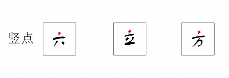
Il punto verticale:
Alla luce di quest’ultime tre immagini è facilmente intuibile un pensiero del tipo: sembrano tutti uguali e allo stesso momento tutti diversi; vedete anche come diversi modi di scrivere lo stesso carattere (utilizzando diversi stili, come ho volutamente inserito nelle immagini) provochino a volte un utilizzo di un punto diverso. L’importante in questo momento è sapere in linea di massima come disegnare questo tratto, se scendere verso destra, verso sinistra o verso il basso; la forma del punto si adatterà in futuro alla persona che lo traccerà.
La famiglia dei punti è vasta e spesso non è così facile interpretare un tratto come punto, in quanto come abbiam visto, alcuni di essi assomigliano più a dei tratti lunghi. La pratica vi porterà però a individuare la tecnica di tracciatura, grazie alla quale sarà possibile verificare l’esatta corrispondenza del tratto.

Welcome to this new article about Chinese writing! In the last episode we saw the first two fundamental strokes, the horizontal one and the vertical one. In this chapter I will speak of another one, only one, but extremely important: the dot. On it there would be a whole bunch of facts to say; starting from the techniques of writing, to the variations. For these reasons our new stroke will be described alone.
Let’s start saying the importance of dot resides into its own drawing technique, which it’s used into many other strokes. Horizontal and vertical strokes, in fact, starts and ends with the same brush movements we use to draw dots.
Place the brush on the upper left side of the area where the dot will be drawn and apply a slight pressure in order to rest part of the bristles to the paper. Brush bristles have an inclination of about 45 ° and the brush itself doesn’t follow a perfectly vertical but inclined movement. Move the brush downwards to define the lower and right part of the dot, which ends with the movement of the brush “to return” upwards to the left; in this way the dot will have a definite shape.
Dot is also called “diăn”, whose character is “点”; at first sight this stroke seems relatively simple to draw but soon you’ll discover that it is perhaps the most difficult to master; the dot is a rock on balance, skilfully drawn to give it physical and visual balance. The dot gives completeness to the character, as eyes of a person complete the face to give visual ability. The image above shows the direction of the most common dots, from left to right and down. It’s in fact also called “yòu diăn” whose characters are: “右 点”.
As mentioned previously, this stroke offers a wide range of variations, not only in shape but also in the way in which they are drawn in groups; in the image below you can see how many shapes it can be traced:
N° 1 represents the “inverse” form of the right dot, in fact it goes down to the left and the brush makes the same movement, but reversed. N° 2 is a more “stretched” shape of the basic dot while N° 3 changes in shape.
When to use one or the other variant? It basically depends on the use that will be made of the stroke in the character. Speaking in general terms, the first variant is usually put on the left side of a character, as you can see for example in “bì”: 必 or in “heart” radical present in many characters: 忙, 性. The second variant, in contrast to the first one, is usually put on the right side of the character, as in the examples shown: 外. In this case the dot is slightly stretched. The third variant is used in the lower parts of characters, such as: 六, when it’s placed in pairs with another dot that follows the opposite direction.
The classic dot comes in all cases where it is not necessary to use variants: 太, where the dot is positioned at the bottom; 心, where the classic dot is the central of the three; 火, where the dot is on the left of the character.
A few lines above we talked about the difference in writing also referred to the presence of groups of dots; in the image below you can see the two main groups of dots used in a large variety of characters:
First one represents the “compact” version of “water” and intervenes as a radical in families of characters that have to do with the liquid element. Pay attention to how the three dots are drawn, with the lower one following an upward trend.
The second group of dots is the representation of “heat” (it’s present in fact in “hot” character). Also in this case the 4 dots are drawn in 4 different ways.
Here below I’ll try to divide in a slightly simpler way some variations of the dot, including the “standard” one, completing the whole with their names and the characters in which they are used; the part of interest is shown in red.
Left dot:
Right dot:
Vertical dot:
In the light of these last three images it’s easy to think: they all look the same and at the same time they are all different. See also how different ways of writing the same character (using different styles, as I have deliberately inserted in the images) sometimes cause a use of a different dot. The important thing at this time is to know: first, how to draw this stroke, whether to go down to the right or to the left ; the shape of the dot will adapt itself to the person who will trace it.
The family of dots is huge and often isn’t so easy to interpret a stroke as a dot, as we have seen, some of them look more like long stretches. The practice will however lead you to identify the tracking technique, thanks to which you can check the exact correspondence of the stroke.
Stay tuned!
