
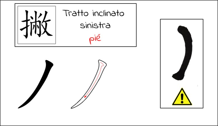
Questo nuovo capitolo sulla stesura dei principali tratti calligrafici si arricchisce di due nuovi elementi: il tratto inclinato verso sinistra e quello inclinato verso destra. Potremmo dire che essi rappresentano le “gambe” di un carattere, le quali permettono di donargli un’estrema dinamicità. Partiremo con la spiegazione riferita al tratto inclinato verso sinistra, il cui nome è “piĕ” e il cui carattere è “撇”. Essendoci varianti, a volte di notevole importanza, il tratto “standard” viene denominato “斜撇”, con una traduzione che potrebbe essere vista come “inclinato verso il basso e a sinistra”. La forma del tratto ricorda a volte la proboscide di un elefante; esso non è verticale, sebbene la stesura parta nello stesso modo; occorre infine ricordarsi che esso sfocia in una punta. Nella figura sottostante è possibile vedere il movimento del pennello, che come già spiegato negli scorsi articoli, esegue il movimento usato nel punto per creare la testa del tratto:
L’errore più comune che si presenta durante la stesura di questo tratto è il cosiddetto “arco”, visibile nell’immagine con il simbolo di pericolo; il pennello ha dato una forma troppo arcuata al tratto, il quale sembra più una “C” capovolta
Passerò ora a descrivere il movimento intero del pennello; a tal proposito è opportuno introdurre un concetto importante del quale occorrere tenere conto durante l’utilizzo del pennello per la creazione delle teste e delle code: due possono essere i movimenti, che porteranno a due risultati diversi, il movimento che rivela l’appoggio del pennello e il movimento che lo nasconde (per quanto riguarda la testa) e il movimento che scopre o copre l’uscita del pennello dal foglio (per la coda). Ho preferito citare in questo articolo la cosa perché il tipo di tratto si presta bene . Qui sotto potete vedere nello specifico i due tipo di entrata:
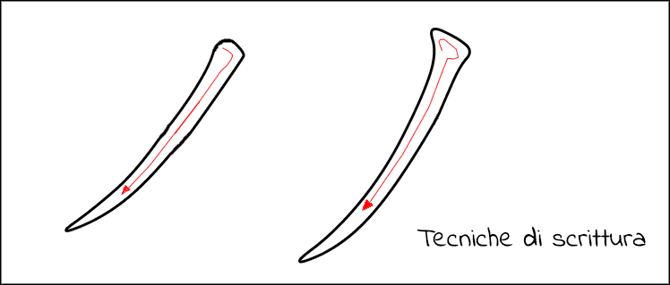
A prima vista i due movimenti possono sembrare se non identici, quasi. E’ innegabile però che uno sguardo più approfondito possa far capire meglio ciò di cui stiam parlando; nel tratto a sinistra il pennello viene appoggiato alla carta ed effettua un movimento verso destra e verso il basso a 45° circa, per poi effettuare il percorso inclinato e dare la forma al tratto. Il movimento a destra viene effettuato in modo che il pennello copra la propria entrata passandoci sopra, e continuando il movimento normalmente.
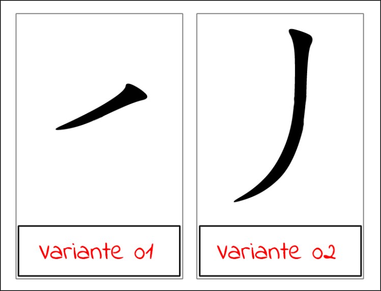
Come per tutti i tratti, anche l’inclinato verso sinistra presenta delle varianti di nota, che si differiscono per forma e inclinazione. Una di esse presenta un tratto abbastanza corto e fortemente tendente a sinistra. L’altra variante assomiglia al tratto standard ma scende più in verticale per poi terminare a punta come di consueto. L’utilizzo di una determinata variante o del tratto comune dipende dal carattere, dalla posizione del tratto stesso. Diverse varianti, poi, vengono eseguite con diverse velocità di scrittura.
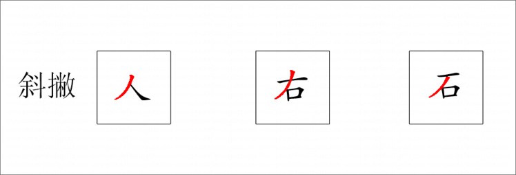
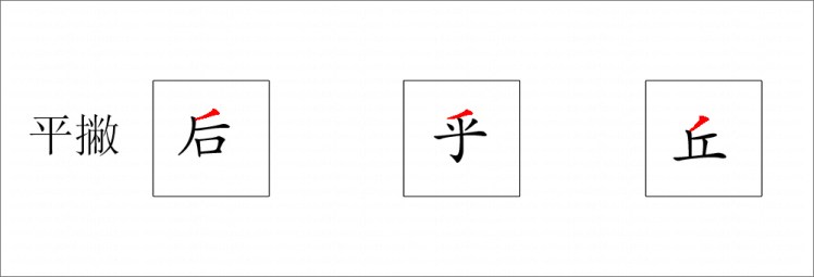
Di seguito vengono postati gli utilizzi dei diversi tratti discendenti verso sinistra con alcuni esempi di caratteri. Come sempre il tratto indicativo viene colorato in rosso.
Tratto discendente a sinistra “standard”:
Tratto discendente a sinistra corto:
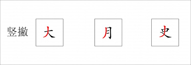
Tratto discendente a sinistra verticale:
Passiamo al secondo tratto di questo articolo, quello inclinato verso destra, anche chiamato “nà”, il cui carattere è “捺”. Non credo ci sia bisogno di spiegazioni per specificare di che tratto si tratti; come il discendente a sinistra, il discendente a destra viene utilizzato per dare una sorta di stabilità al terreno su cui appoggia il carattere e in questo caso l’evidente “piede” è così evidente da giocare un ruolo decisivo. Il carattere standard si presenta con un’inclinazione di circa 45° e culmina con un’apertura del pennello a formare la coda del carattere:
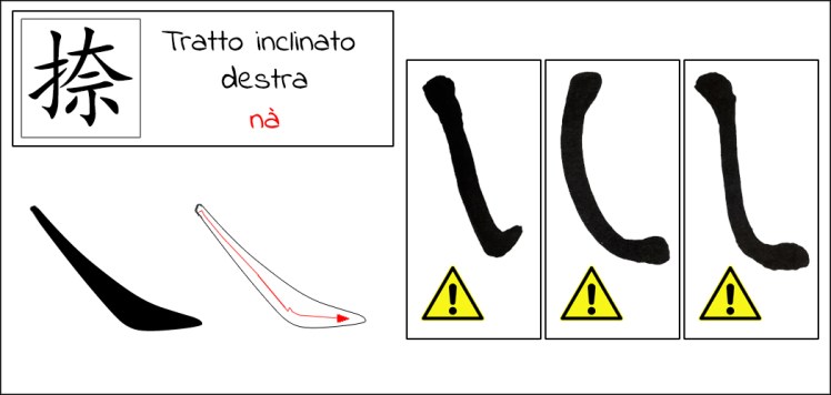
Passiamo in rassegna i principali tipi di errore che possono insorgere durante la stesura del tratto inclinato a destra: a sinistra potete vedere come la coda del tratto sia stata tracciata in modo errato, a formare un uncino; sicuramente non il modo migliore per terminare questo tipo di tratto. In centro troviamo “l’arco” invertito, causato da un’eccessiva angolazione del pennello in fase di tracciatura del tratto. Infine, a destra, la testa e la coda sono stati esageratamente ingigantiti, dando al tratto una forma inusuale.
Il tratto discendente verso destra parte con un movimento che lascia un testa un po’ più “a punta” rispetto ad altri tratti; il movimento del pennello viene di seguito indicato:
– partire dalla zona alta a sinistra, dove il tratto avrà inizio; appoggiare il pennello e cominciare a muoverlo verso il basso e verso destra, per ottenere una testa più appuntita;
– scendere verso il basso con una certa inclinazione, e al raggiungimento della “base” del tratto, premere un po’ di più il pennello per dare l’inizio della forma della coda (qui sarà il “piede”);
– cambiare direzione al pennello (più orizzontale e verso destra) e gradualmente togliere pressione per concludere la coda;
Il tratto inclinato verso destra si presenta con una variante di un certo rilievo, molto utilizzata e molto importante, la quale ha una forma più orizzontale e simile ad una sorta di sciabola di Kung Fu:

L’utilizzo di tale variante entra in gioco in quei caratteri che necessitano di una “base” più larga, come una specie di “barca” sulla quale appoggia il resto del carattere. Di seguito ovviamente posterò come sempre ogni variante con i rispettivi tre esempi di utilizzo.
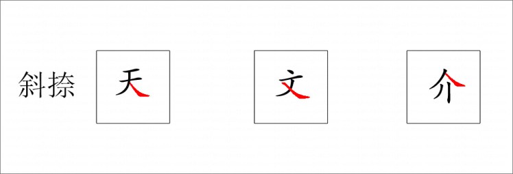
Tratto inclinato verso destra “standard”:
Tratto inclinato a destra, variante “lunga”:

Stay tuned!

This new chapter about drawing calligraphic strokes is enriched by two new elements: the left and the right strokes. We could say that they represent the “legs” of a character, which allow it to give it extreme dynamism. We’ll start with the explanation of left stroke, whose name is ” piĕ” and whose character is “撇”. Because of variants, sometimes of considerable importance, the “standard” stroke is called “斜 撇”, with a translation that could means “tilted down and left”. The shape of this stroke is sometimes reminiscent of an elephant’s proboscis; it’s not vertical, although it starts in the same way, and it flows into a point. In the figure below you can see the movement of the brush, which as already explained in the previous articles, performs the movement used in dots to create the stroke head:
The most common error that occurs during the drafting of this stroke is the so-called “bow”, visible in the image with the danger symbol; the brush has given a too arched shape to the stroke, which seems more like an inverted “C”
I will now describe the whole movement of the brush; in this regard, it is advisable to introduce an important concept which should be taken into account when using the brush to create heads and tails: two movements can lead to two different results, the movement that reveals the support of the brush and the movement that hides it (regarding the head) and the movement that discovers or covers the output of the brush from the sheet (for the tail). I preferred to mention this in the article because the type of stroke lends itself well. Below you can see specifically the two types of entry:
At first glance the two movements may seem almost identical, almost. It is undeniable, however, that a closer look can better understand what we are talking about; in the left stroke brush is placed on the paper and makes a movement to the right and down to about 45 °, then make the inclined path and give shape to the stroke. The movement to the right is done with the brush that covers its entrance by passing over it, and continuing the movement normally.
As for all strokes, also the left tilted one presents some variations, which differ in shape and inclination. One of them has a fairly short stretch and strongly tending to the left. The other variant resembles the standard stroke but it goes down more vertically and then ends at the tip as usual. Using a specific variant or the common one depends on the character and on the position of the stroke itself. Different variants, then, are performed with different writing speeds.
Below are the uses of the different left strokes with some examples of characters. As always, the indicative stroke is colored in red.
Standard stroke:
Short left stroke:
Vertical left stroke:
Let’s move on to the second part of this article, right tilted stroke, also called “nà”, whose character is “捺“. I don’t think there is an need for explanations to specify what the stroke is; like the left tilted one, the descendant on the right is used to give a sort of stability to the ground on which the character rests, and in this case the obvious “foot” is so evident that it plays a decisive role. The standard stroke has an inclination of about 45 ° and culminates with an opening of the brush to form the tail of the character:
Let’s review the main types of mistakes that may arise during the drafting of the right tilted stroke: on the left one you can see how the tail of the stroke has been traced incorrectly, to form a hook; definitely not the best way to end this kind of stroke. In the center we find the inverted “arc”, caused by an excessive angle of the brush when tracing the stroke. Then, on the right, the head and the tail have been exaggeratedly enlarged, giving to the stroke an unusual shape.
The right tilted stroke starts with a movement that leaves a head a bit ‘more “to tip” than other strokes; the movement of the brush is described below:
– start from the upper area on the left, where the stroke will “born”; lean the brush and begin to move it down and to the right, to obtain a more pointed head;
– go down with a certain inclination, and when reaching the “base” of the stroke, press the brush a little more to give the beginning of the shape of the tail (here it will be the “foot”);
– change direction to the brush (more horizontal and to the right) and gradually remove pressure to complete the tail;
The inclination to the right shows a variation of a certain relief, very used and very important, which has a more horizontal shape and similar to a sort of kung fu saber:
The use of this variant comes in those characters that need a wider “base”, like a sort of “boat” on which the rest of the character rests. Below, of course, I will post as usual every variant with the respective three examples of use.
Standard right tilted stroke:
Right tilted stroke, “long” variant:
Stay tuned!
